本章主要練習:
提示:下方黑色向右箭頭 ![]() 可以點擊看更多
可以點擊看更多
74-622
Day 74 Goals: what you will make by the end of the day
-
How to make time-series data comparable by resampling and converting to the same periodicity (e.g., from daily data to monthly data).
-
Fine-tuning the styling of Matplotlib charts by using limits, labels, linestyles, markers, colours, and the chart’s resolution.
-
Using grids to help visually identify seasonality in a time series.
-
Finding the number of missing and NaN values and how to locate NaN values in a DataFrame.
-
How to work with Locators to better style the time axis on a chart
-
Review the concepts learned in the previous three days and apply them to new datasets
74-623
Data Exploration - Making Sense of Google Search Data
本節目的在讓學生快速複習前面幾章的 pandas method。以下以 tesla 資料為例:
-
read_csv()
df_tesla = pd.read_csv(‘TESLA Search Trend vs Price.csv’) -
shape
df_tesla.shape -
head()
df_tesla.head() -
describe()
df_tesla.describe()
SAMPLE_CODE
import pandas as pd
import matplotlib.pyplot as plt

df_tesla = pd.read_csv('TESLA Search Trend vs Price.csv')

df_btc_search = pd.read_csv('Bitcoin Search Trend.csv')
df_btc_price = pd.read_csv('Daily Bitcoin Price.csv')

df_unemployment = pd.read_csv('UE Benefits Search vs UE Rate 2004-19.csv')

print(df_tesla.shape)
df_tesla.head()

print(f'Largest value for Tesla in Web Search: {df_tesla.TSLA_WEB_SEARCH.max()}')
print(f'Smallest value for Tesla in Web Search: {df_tesla.TSLA_WEB_SEARCH.min()}')

df_tesla.describe()
74-624
Data Cleaning - Resampling Time Series Data
3 + 1 Challenges:
Challenge 1: 檢查資料是否齊全
df_tesla.isna().values.any()
print(f'Missing values for Tesla?: {df_tesla.isna().values.any()}')
print(f'Missing values for U/E?: {df_unemployment.isna().values.any()}')
print(f'Missing values for BTC Search?: {df_btc_search.isna().values.any()}')
print(f'Missing values for BTC price?: {df_btc_price.isna().values.any()}')
Challenge 2 & 3: 如果資料有缺,找出所在位置並刪除
.dropna()
df_btc_price[df_btc_price.CLOSE.isna()]
# To remove a missing value we can use .dropna()
# method 1
df_btc_price = df_btc_price.dropna()
# method 2: The inplace argument allows to overwrite our DataFrame
df_btc_price.dropna(inplace=True)
Challenge 4: 將資料型態由 str 改為 Datetime object
.to_datetime()
# type: str
type(df_tesla['MONTH'][1])

# Convert strings into objects:
df_tesla.MONTH = pd.to_datetime(df_tesla.MONTH)
df_btc_search.MONTH = pd.to_datetime(df_btc_search.MONTH)
df_unemployment.MONTH = pd.to_datetime(df_unemployment.MONTH)

# type: pandas._libs.tslibs.timestamps.Timestamp
type(df_tesla['MONTH'][1])

type(df_btc_price['DATE'][1])
df_btc_price.DATE = pd.to_datetime(df_btc_price.DATE)
參考資料:resample frequency
https://pandas.pydata.org/pandas-docs/stable/user_guide/timeseries.html#dateoffset-objects

# This particular day contains a day light savings time transition
ts = pd.Timestamp("2016-10-30 00:00:00", tz="Europe/Helsinki")

# Respects absolute time
ts + pd.Timedelta(days=1)
Out[145]: Timestamp('2016-10-30 23:00:00+0200', tz='Europe/Helsinki')

# Respects calendar time
ts + pd.DateOffset(days=1)
Out[146]: Timestamp('2016-10-31 00:00:00+0200', tz='Europe/Helsinki')

friday = pd.Timestamp("2018-01-05")

friday.day_name()
Out[148]: 'Friday'

# Add 2 business days (Friday --> Tuesday)
two_business_days = 2 * pd.offsets.BDay()

two_business_days.apply(friday)
Out[150]: Timestamp('2018-01-09 00:00:00')

friday + two_business_days
Out[151]: Timestamp('2018-01-09 00:00:00')

(friday + two_business_days).day_name()
Out[152]: 'Tuesday'
74-625
Data Visualisation - Tesla Line Charts in Matplotlib
.twinx() 兩條縱軸
SAMPLE_CODE
# Increase the figure size (e.g., to 14 by 8).
plt.figure(figsize=(14,8), dpi=120)

# Rotate the text on the x-axis by 45 degrees.
plt.xticks(fontsize=14, rotation=45)

ax1 = plt.gca()
ax2 = ax1.twinx()

# Increase the font sizes for the labels and the ticks on the x-axis to 14.
ax1.set_ylabel('TSLA Stock Price', color='#E6232E', fontsize=14)
ax2.set_ylabel('Search Trend', color='skyblue', fontsize=14)

# Rotate the text on the x-axis by 45 degrees.
# plt.xticks(fontsize=14, rotation=45)

# Add a title that reads 'Tesla Web Search vs Price'
plt.title('Tesla Web Search vs Price', fontsize=18)

# Make the lines on the chart thicker.
ax1.plot(df_tesla.MONTH, df_tesla.TSLA_USD_CLOSE, color='#E6232E', linewidth=3)
ax2.plot(df_tesla.MONTH, df_tesla.TSLA_WEB_SEARCH, color='skyblue', linewidth=3)

# Keep the chart looking sharp by changing the dots-per-inch or DPI value.
plt.figure(figsize=(14,8), dpi=120)

# Set minimum and maximum values for the y and x-axis.
# Hint: check out methods like set_xlim().
ax1.set_ylim([0, 600])
ax1.set_xlim([df_tesla.MONTH.min(), df_tesla.MONTH.max()])

# Finally use plt.show() to display the chart below the cell instead of relying on the automatic notebook output.
plt.show()
74-626
Using Locators and DateFormatters to generate Tick Marks on a Time Line
三步驟
步驟一:import matplotlib.dates
import matplotlib.dates as mdates
步驟二:Notebook Formatting & Style Helpers
a YearLocator() and a MonthLocator() objects, which will help Matplotlib find the years and the months.
DateFormatter(), which will help us specify how we want to display the dates.
# Create locators for ticks on the time axis
years = mdates.YearLocator()
months = mdates.MonthLocator()
years_fmt = mdates.DateFormatter('%Y')

# Register date converters to avoid warning messages
from pandas.plotting import register_matplotlib_converters
register_matplotlib_converters()
步驟三:Adding Locator Tick Marks
# format the ticks
ax1.xaxis.set_major_locator(years)
ax1.xaxis.set_major_formatter(years_fmt)
ax1.xaxis.set_minor_locator(months)
SAMPLE_CODE
# ...
import matplotlib.dates as mdates

# Create locators for ticks on the time axis
years = mdates.YearLocator()
months = mdates.MonthLocator()
years_fmt = mdates.DateFormatter('%Y')

# Register date converters to avoid warning messages
from pandas.plotting import register_matplotlib_converters
register_matplotlib_converters()

# ...

# Increase the figure size (e.g., to 14 by 8).
plt.figure(figsize=(14,8), dpi=120)

# Rotate the text on the x-axis by 45 degrees.
plt.xticks(fontsize=14, rotation=45)

ax1 = plt.gca()
ax2 = ax1.twinx()

# ■ ■ format the ticks
ax1.xaxis.set_major_locator(years)
ax1.xaxis.set_major_formatter(years_fmt)
ax1.xaxis.set_minor_locator(months)

# Increase the font sizes for the labels and the ticks on the x-axis to 14.
ax1.set_ylabel('TSLA Stock Price', color='#E6232E', fontsize=14)
ax2.set_ylabel('Search Trend', color='skyblue', fontsize=14)

# Rotate the text on the x-axis by 45 degrees.
# plt.xticks(fontsize=14, rotation=45)

# Add a title that reads 'Tesla Web Search vs Price'
plt.title('Tesla Web Search vs Price', fontsize=18)

# Make the lines on the chart thicker.
ax1.plot(df_tesla.MONTH, df_tesla.TSLA_USD_CLOSE, color='#E6232E', linewidth=3)
ax2.plot(df_tesla.MONTH, df_tesla.TSLA_WEB_SEARCH, color='skyblue', linewidth=3)

# Keep the chart looking sharp by changing the dots-per-inch or DPI value.
plt.figure(figsize=(14,8), dpi=120)

# Set minimum and maximum values for the y and x-axis.
# Hint: check out methods like set_xlim().
ax1.set_ylim([0, 600])
ax1.set_xlim([df_tesla.MONTH.min(), df_tesla.MONTH.max()])

# Finally use plt.show() to display the chart below the cell instead of relying on the automatic notebook output.
plt.show()
74-627
Data Visualisation - Bitcoin: Line Style and Markers
6 Challenges
plt.figure(figsize=(14,8), dpi=120)

# Challenge 1: Modify the chart title to read 'Bitcoin News Search vs Resampled Price'

plt.title('Bitcoin News Search vs Resampled Price', fontsize=18)

# Rotate the text on the x-axis by 45 degrees

plt.xticks(fontsize=14, rotation=45)

ax1 = plt.gca()

ax2 = ax1.twinx()

# Challenge 2: Change the y-axis label to 'BTC Price'

ax1.set_ylabel('BTC Price', color='#F08F2E', fontsize=14)

ax2.set_ylabel('Search Trend', color='skyblue', fontsize=14)

ax1.xaxis.set_major_locator(years)

ax1.xaxis.set_major_formatter(years_fmt)

ax1.xaxis.set_minor_locator(months)

# Challenge 3: Change the y- and x-axis limits to improve the appearance

ax1.set_ylim(bottom=0, top=15000)

ax1.set_xlim([df_btc_monthly.index.min(), df_btc_monthly.index.max()])

# Challenge 4: Investigate the linestyles to make the BTC closing price a dashed line

ax1.plot(df_btc_monthly.index, df_btc_monthly.CLOSE,  color='#F08F2E', linewidth=3, linestyle='--')

# Challenge 5: Investigate the marker types to make the search datapoints little circles

ax2.plot(df_btc_monthly.index, df_btc_search.BTC_NEWS_SEARCH, color='skyblue', linewidth=3, marker='o')

plt.show()

# Challenge 6: Were big increases in searches for Bitcoin accompanied by big increases in the price?

參考資料
linestyles
matplotlib.pyplot.plot — Matplotlib 3.2.1 documentation
marker types
matplotlib.markers — Matplotlib 3.2.1 documentation
74-628
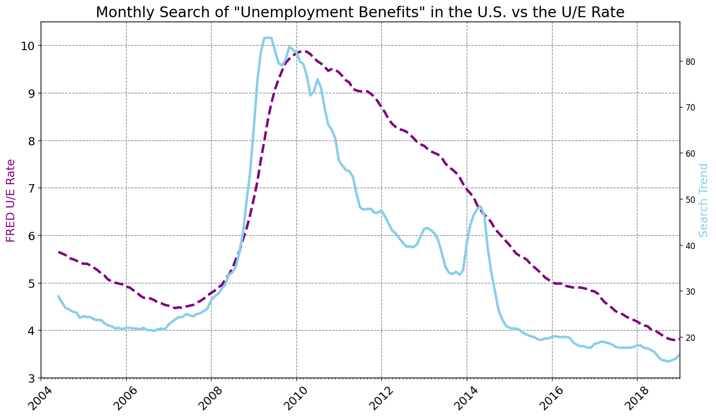
Data Visualisation - Unemployment: How to use Grids
本節重點:Grids 格線
5 Challenges
plt.figure(figsize=(14,8), dpi=120)

# Challenge 1: Change the title to: Monthly Search of "Unemployment Benefits" in the U.S. vs the U/E Rate

plt.title('Monthly Search of "Unemployment Benefits" in the U.S. vs the U/E Rate', fontsize=18)

plt.yticks(fontsize=14)

plt.xticks(fontsize=14, rotation=45)

ax1 = plt.gca()

ax2 = ax1.twinx()

# Challenge 2: Change the y-axis label to: FRED U/E Rate

ax1.set_ylabel('FRED U/E Rate', color='purple', fontsize=14)

ax2.set_ylabel('Search Trend', color='skyblue', fontsize=14)

ax1.xaxis.set_major_locator(years)

ax1.xaxis.set_major_formatter(years_fmt)

ax1.xaxis.set_minor_locator(months)

# Challenge 3: Change the axis limits

ax1.set_ylim(bottom=3, top=10.5)

ax1.set_xlim([df_unemployment.MONTH.min(), df_unemployment.MONTH.max()])

# Challenge 4: Add a grey grid to the chart to better see the years and the U/E rate values. Use dashed lines for the line style.

ax1.grid(color='grey', linestyle='--')

# Show the grid lines as dark grey lines

ax1.grid(color='grey', linestyle='--')


# Change the dataset used

ax1.plot(df_unemployment.MONTH, df_unemployment.UNRATE, color='purple', linewidth=3, linestyle='--')

ax2.plot(df_unemployment.MONTH, df_unemployment.UE_BENEFITS_WEB_SEARCH, color='skyblue', linewidth=3)


plt.show()

# Challenge 5: Can you discern any seasonality in the searches? Is there a pattern?

參考資料:grid
更改取樣頻率
plt.figure(figsize=(14,8), dpi=120)

# Challenge 1: Change the title to: Monthly Search of "Unemployment Benefits" in the U.S. vs the U/E Rate
plt.title('Monthly Search of "Unemployment Benefits" in the U.S. vs the U/E Rate', fontsize=18)

plt.yticks(fontsize=14)
plt.xticks(fontsize=14, rotation=45)

ax1 = plt.gca()
ax2 = ax1.twinx()

ax1.xaxis.set_major_locator(years)
ax1.xaxis.set_major_formatter(years_fmt)
ax1.xaxis.set_minor_locator(months)

# Challenge 2: Change the y-axis label to: FRED U/E Rate
ax1.set_ylabel('FRED U/E Rate', color='purple', fontsize=14)
ax2.set_ylabel('Search Trend', color='skyblue', fontsize=14)

# Challenge 3: Change the axis limits
ax1.set_ylim(bottom=3, top=10.5)
# ax1.set_xlim([df_unemployment.MONTH.min(), df_unemployment.MONTH.max()])
ax1.set_xlim([df_unemployment.MONTH[0], df_unemployment.MONTH.max()])

# Challenge 4: Add a grey grid to the chart to better see the years and the U/E rate values. Use dashed lines for the line style.
ax1.grid(color='grey', linestyle='--')

# Show the grid lines as dark grey lines
ax1.grid(color='grey', linestyle='--')

# ■ ■ Calculate the rolling average over a 6 month window
roll_df = df_unemployment[['UE_BENEFITS_WEB_SEARCH', 'UNRATE']].rolling(window=6).mean()

# ■ ■ Change the dataset used
ax1.plot(df_unemployment.MONTH, roll_df.UNRATE, color='purple', linewidth=3, linestyle='--')
ax2.plot(df_unemployment.MONTH, roll_df.UE_BENEFITS_WEB_SEARCH, color='skyblue', linewidth=3)

plt.show()

# Challenge 5: Can you discern any seasonality in the searches? Is there a pattern?
74-629
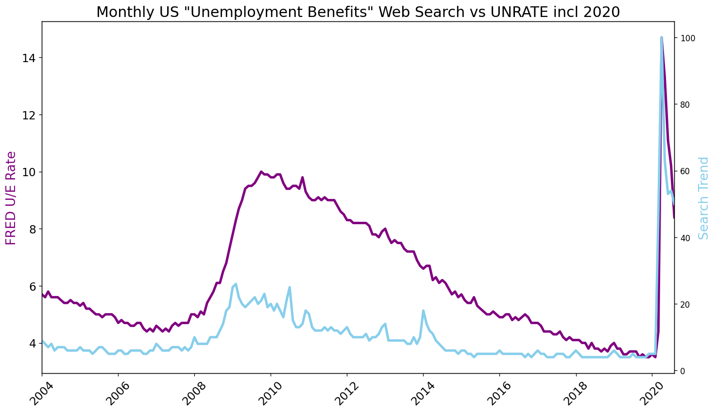
Data Visualisation - Unemployment: The Effect of New Data
SAMPLE_CODE
df_ue_2020 = pd.read_csv('UE Benefits Search vs UE Rate 2004-20.csv')
df_ue_2020.MONTH = pd.to_datetime(df_ue_2020.MONTH)

plt.figure(figsize=(14,8), dpi=120)
plt.yticks(fontsize=14)
plt.xticks(fontsize=14, rotation=45)
plt.title('Monthly US "Unemployment Benefits" Web Search vs UNRATE incl 2020', fontsize=18)

ax1 = plt.gca()
ax2 = ax1.twinx()

ax1.set_ylabel('FRED U/E Rate', color='purple', fontsize=16)
ax2.set_ylabel('Search Trend', color='skyblue', fontsize=16)

ax1.set_xlim([df_ue_2020.MONTH.min(), df_ue_2020.MONTH.max()])

ax1.plot(df_ue_2020.MONTH, df_ue_2020.UNRATE, 'purple', linewidth=3)
ax2.plot(df_ue_2020.MONTH, df_ue_2020.UE_BENEFITS_WEB_SEARCH, 'skyblue', linewidth=3)

plt.show()
74-630
Learning Points & Summary
-
How to use .describe() to quickly see some descriptive statistics at a glance.
-
How to use .resample() to make a time-series data comparable to another by changing the periodicity.
-
How to work with matplotlib.dates Locators to better style a timeline (e.g., an axis on a chart).
-
How to find the number of NaN values with .isna().values.sum()
-
How to change the resolution of a chart using the figure’s dpi
-
How to create dashed ‘–’ and dotted ‘-.’ lines using linestyles
-
How to use different kinds of markers (e.g., ‘o’ or ‘^’) on charts.
-
Fine-tuning the styling of Matplotlib charts by using limits, labels, linewidth and colours (both in the form of named colours and HEX codes).
-
Using .grid() to help visually identify seasonality in a time series.